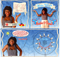
After looking through previous student digipak and advertisements I think this one is my favourite. Both the digipak and advert have a clear readable font. The images are clear and in focus - there no blurring or stretching. They have followed the three colour rule , which is seen in both the digipak and advert. Overall both of their creations follow the basic rules on what to do to create a great digipak.
Even though the above student creation for 'Coco Blu; is a perfect example of a great digipak / advert i want to comment on this advertisement for 'Amber Gold' . This followed the rules on how to create a advert perfectly. I think it looks very believeable and is something i want to use as inspiration for when i create the advert for 'Chrystella'.
This digipak and advert seem to do everything that would have been in the dont section of the rules. The images are stretched - which unflatter the artist. The text blends in with the background , which make it hard to actually read what is written. The CD does not have any information on the spine ( such as artist name , album title, number). The images do not fit with the genre and neither does the name of the album.


No comments:
Post a Comment