Wednesday, 30 November 2011

Calvin Harris

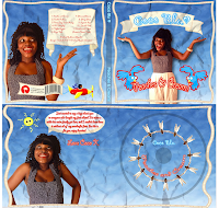
In lesson we looked at a song called 'ready for the weekend' by Calvin Harris and we also looked at the digipak. We noticed that the digipak had some links to the music video. As you can notice the colours that were in the original video are also the same colours that are on the digipak itself. This is a really nice link and the colours are so bold it automatically grabs the buyers attention.

Below are some screenshots from the music video:

 As you can tell from bellow the screen shots arre from the video is the same screenshot on the Digipak cover.


Digipak research

In lesson we had a brief discussion about Digipaks and the music industry's and here are some of the things we discussed.


What is a digipak?
  • A modern approach to a CD pakaging
  • Allows more infomations about the artist/band
What the outside of the digipak should look like:

  • Artist name (clear easy to read nice font)
  • Track listing (same font as artist or album name)
  • Production info
  • Image of the artist preferred
  • Web address
  • Record label/name
  • Distributor; producer possibly price.
  • Bar code
  • Promotional sticker (gain audience attention of tour information or possible features).
  • Same font throughout the digipak
  • Catalog number on spine of digipak (easy to be found on shelf's)
Inside of digipak:
  • Repeat of track list some may include more information for example length of the song
  • Graphic designs, Image of artist; font colour designs)
  • Acknowledgments (small font maximum of 2lines would be reasonable)
  • Links of images from the inside and outside
Adverts:
  • Include tour dates
  • Artist name & Album name
  • Release date/record label logo
  • Artists Website
  • Review quoted from magazines
  • Visual style colour scheme.
Overall digipak
  • 3-4 colous max
  • No more that 2 -3 different fonts
  • Elements of different design, not simple images lifted from video or websites.
Why are CD's still in use:
  • Some people like collecting CD's
  • Want to keep themusic industry going by buying music 
  • Old fashioned people tend to still by music 
What ancilliary products can you think of:
  • Newspapers
  •  HMV Adverts
  • Social network e.g Facebook, Myspace
  •  T.V Adverts
  • Billboards 
  • Music magazines
  • Gigs
  • Carte de visite (artists sign pictures and gives them out to fans)
How are Digipaks useful to Artist:
  • Helps promote the Artist and Album
  • To make Money
  • Build a fan base
  • Boost sales of CD's for music industry
  • Image of the artist is important to the audience
  • Useful for establishing genre
  • Visual representation; their image shows what they want to represent at that time.

How are Digipaks useful to the music industry? 
  • Boost sales of CD's for music industry
  • Help music industry grow

In lesson out teacher ask the whole a question "who has paid for music in the past year" 2/15 paid for music in the past year in my class. Most people download music and some download the art work e.g the album cover. I noticed that my generation (the younger people of today) download music and hardly every by music.

Tuesday, 29 November 2011

Audience Feedback

This is Jazzine, she's a media student, she watched our music video and gave some feedback

Audience Feedback.

This is Jade giving her personal feedback for our video. Sorry if you cant hear her, the room is a bit noisy.

Previous student digipak analysis


After looking through previous student digipak and advertisements I think this one is my favourite. Both the digipak and advert have a clear readable font. The images are clear and in focus - there no blurring or stretching. They have followed the three colour rule , which is seen in both the digipak and advert. Overall both of their creations follow the basic rules on what to do to create a great digipak.

Even though the above student creation for 'Coco Blu; is a perfect example of a great digipak / advert i want to comment on this advertisement for 'Amber Gold' . This followed the rules on how to create a advert perfectly. I think it looks very believeable and is something i want to use as inspiration for when i create the advert for 'Chrystella'.

This digipak and advert seem to do everything that would have been in the dont section of the rules. The images are stretched - which unflatter the artist. The text blends in with the background , which make it hard to actually read what is written. The CD does not have any information on the spine ( such as artist name , album title, number). The images do not fit with the genre and neither does the name of the album.

DIGIPAK AND ADVERT ANALYSIS

DikiPak Analysis


INDIYA- IN MY OWN WORDS

THIS PROMOTIONAL ADVERT


STEPHANIE JACKSON- THE PROMOTIONAL ADVERT


I love this promotional advert because the picture of the artist stands out very well. The colours used are warm and very feminine representing the artist as a bold character with much confidence. It looks like something I would see on a  billboard and catches my attention straight away. It is evident that she scheduled a photoshoot of some sort because of the and focused image of the artist.

This promotional advert is very simplistic and fresh and that is what i love about this one. The  use of colours fit the artist very well and represents her as a new fresh artist.  The close up of this promotional advert is something i  would like to incorporate into my own promotional advert. This  looks like something I would see and want to actually purchase the album. The artist draws me in with her eye contact and I like the way that some fierceness and confidence is presented too.


This digipak is  exceptional and i absolutely love the way the images blend in together so well. The font is perfect and does not overpower the artist. The colour scheme is run through out and brings a connection between the promotional advert and the digipak. She included the necessary information such as the barcode, record label logo, catalogue number and clear close ups of the artist.


Just like the digipak above, the colour scheme here is constant and runs through each panel. The font is kept through to the promotional advert and this is great in connecting the two products together. The artist is being represented effectively as the images are close ups which most digipaks have, therefore making it conventional. 


Analyse of previous students digipak

Indiya - In my own words:


This was one of my favourite student music videos because i felt that it ticked every box that it needed to produce a good digipak. I noticed that the digipak consisted of a two clear and easy to read fonts, the font was not to big but a reasonable size for people to read. the fonts were not that much different from each other but i could see a diference. the images that were used are not taken from the internet therefore it was taken by the student as the image is of the artist. i liked the background of the image as it makes the artist stand out more and the attention is on them; a simple plain white background d worked well with this digipak.

I liked this digipak mainly because of the shots that was taken this is because photos were clear and in focus, her skin look clear therefore i presume that some sort of Photoshop editing took place as her skin was glowing and i felt that the black and white adjustments were effective as the same colours; purple,black and white were constant throughout the digipak and there wasn't too much colours going on. Although the digipak doesn't have a layout that flows throughout the digipak it still works! I feel that it works because
as the artist is in all the images in different poses showing different personalities to the artist; from a serious pose to a happy, sexy/seductive to a shy pose. Allows the audience to see different sides to the artist.

However i did notice that there was no catalouge nuber on the spine of the digipak but apart from that it was well presented and this has inspired me to think about maybe doing close ups images for my digipak as it looks more personal and attractive.

Stephanie Jackson - Rumours:


This digipak work really well. the colour scheme throughout the digipak is constant and its confusing. The images are very suttel and calm and sophisticated. I felt that it was a nice touch to have the artists face on the inside of the digipak smiling as it showed a fun side to the artist unlike the front cover as that image was very serious but still very beautiful. The advertisement was also straight to the point and attractive to look at however there was also no catalog number on the spine of the digipak. but overall i thought the colours didn't clash with each other and it worked just right. There wasn't too many fonts either.


I though this didpak was dereadful! and i shall tell you why. The third box of the digipak the image has been stretched a bit too much the reason how i know this is because in the second box of the digipak the artist looks slim. I also picked up on the fact that the second box had colour where the rest of the boxes are in purple. I felt that that specific purple didn't work well with the picture in the third box and it made the digipak look cheap. Furthermore i felt that the colours should be constant throughout the digipak not sections of different colours and edits. This just didn't work for me. There were too many fonts going on in the digipak confusing people. I also noticed that the spine of the digipak did not have the Artists name, catalog number, or the album name which i think is the most important thing because if people wanted to buy that album they wouldn't be able to notice it on the stores shelves because there is no information.


Saturday, 26 November 2011

SKILLS

PRE-PRODUCTION AND PLANNING SKILLS


When it came to our preproduction we had to think carefully first about our locations. Next we had to think about the storyline of our music video and the kind of music video it is going to be. The location and the props and outfit was very important because we had to represent the artist for who she is.  This is not much different from our Thriller planning and pre production because for both projects we had to make a production schedule and plan the props we were going to use as well as our storyline, because we wanted to represent our genre the best that we can.

PLANNING IS AN IMPORTANT PART FOR ANY PROJECT BECAUSE IT OUTLINES EXACTLY WHAT WE WANT TO DO.

Even though we planned to do a disjuncture music video, we decided in the end to do a performance music video, because the song was such a confident song that if we just did a video without performance, it will make it bland.  Also the artist needs to be represented as a confident and vibrant person and the type of music video now suits her very much. SO WE ARE HAPPY WITH OUR FINAL CHOICE


EDITING SKILLS


When it came to editing skills we had to use a lot of this skill throughout this project. In other words our editing had to be on POINT because we needed to get the cuts to the beat and precise too. Our editing needed to also reflect our genre and since our genre is RnB/Pop we needed to cut in a pretty fast pace. The editing to our music video is different to the editing in our thriller because we had to learn how to mark and we used different tools such as the razor tool and the 'in' 'out' procedure to mark correctly which part of the video we want to put in. we also learnt how to sync the clips in with the song. One problem we had was that we felt the song was too long and so we used the volume control to fade it out. This is similar to what we did to our last project, the thriller opening. We used the volume control to add effect to the video and make it more interesting. The biggest difference this year between making the music video and making the thriller last year is that the scenes of the music video do not have to be linear and follow one after the together. Basically it doesn't have to make complete sense, after all it is a music video. Music videos are more creative in in the usage of clips than making a thriller video. Where by thriller videos, the scenes have to follow each other properly and make sense.


Production - Skills development on editing.

Wordle: shai

Editing this year was definitely more difficult than during the AS year. Even though i did use Final Cut Pro last year because of the differences in editing it felt like a whole new program. 

One new skill that i learnt was how to edit between base tracks. This meant that i had to rely more on the razor blade tool to cut in between the base tracks. Also i learnt how to properly edit to the beat of the song. Also being able to properly sync in the base tracks with the song was difficult in the beginning but became easier over the editing period due to using the markers at certain points in the song to keep it in sync. 

Using effects were another skill that i managed to pick up during editing. Effects such as glitter and lights were added to our video using FCP , making the video more interesting and exciting. Slowing down the clips were another skill learnt during the process. This was done by changing the speed in the clip to create a slow motion effect - which can be seen in the last shot of our video.

Overall with a combination of skills learnt and developed last year and this year i believe that my knowledge of Final Cut Pro is wide and i know that if i ever need to use it again i would be fully capable of doing so.


Inspiration in the process.

I feel that, our music video is successful, as we have the only one female artist in our video, we wanted her to be the main FOCUS!


Rhianna is a big inspiration to our video, as she is a confident performer.

Feed back on Rough Cut

As I personally gave a message to my friends, asking them to give some feedback, here is the feed back from them, 
We have already taken this advice forward and used it.

skills development

Preparing:

When we finally decided what song we thought we would be able to make into a good music video we had to then come to a decision on where we wanted to base our music video and what we wanted the music video to represent. In the beginning we wanted to do a narrative music video and all was going well until a member of the group decided they did not want to take part in the music video as we planned to have thre friends throughout the music video. We thought that by having only 2 girls as friends in the music video it wouldnt look right, therefore we decied to change it into a performance video. 

As a group there was one thing that we all deffinately agreed on and that was to make sure we incorporated  backgroud images of colouful grafiti. And the bes pplace to do that we thought would be somewhere in hackney brick lanewere there are loads of grafiti walls. the second location we decided to do was at my house as we wanted to show Chrystella preparing herself for her day and therefore we wanted to show her getting herself all glamed up.

after we had finished and done new shots it looked great.


Friday, 25 November 2011

MY EXPERIENCE

FILMING A MUSIC VIDEO WAS THE EASY PART AND I THINK EVERYONE WOULD AGREE ON THAT, HOWEVER EDITING THE MUSIC VIDEO IS THE NIGHTMARE. 


DESPITE THIS I REALLY ENJOYED THIS EXPERIENCE. I JUST LOVE THE WAY THAT THIS PROJECT BROUGHT MY GROUP TOGETHER AND WE ENDED BEING WITH PEOPLE WE HAVE NEVER WORKED WITH. 


IN TERMS OF MY PERSONAL EXPERIENCE I AM HAPPY WITH WHERE WE ARE AT NOW. I WOULD LOVE TO DO SOMETHING LIKE THIS AGAIN IN THE FUTURE AS I HAVE BUILT ON MY SKILLS SINCE LAST YEAR. 


LAST YEARS EDITING WAS A LINEAR EDITING, MAKING SURE THAT EACH CUT MATCHED THE PREVIOUS ONE, AND THAT THE STORY LINE WAS CLEAR FOR THE AUDIENCE. LAST YEAR WE ALSO HAD TO STICK TO A PARTICULAR GENRE AND EDIT AROUND THAT GENRE. 


BUT......


THIS YEAR OUR EDITING WAS MUCH MORE FAST PACED AND QUICK. OUR EDITING CONSISTED  OF NUMEROUS SHOTS AND IT IS NOT IN A LINEAR FORM. THE GOOD THING IS THE SHOTS DO NOT HAVE TO MATCH BUT IT HAS TO MAKE SENSE. THE DIFFERENCE WITH THE SKILLS IS THAT WE LEARNT HOW TO POSITION THE CAMERA IN A STEADY WAY, REFILMING MANY SHOTS TO CREATE SUCH THINGS AS MATCH CUTS, JUMP CUTS AND SO ON. 


BUT.....


THIS TIME AROUND THERE WAS LESS MATCH CUTS AND MORE CUTS!! CUT TO THE BEAT WAS OUR CHALLENGE THIS YEAR AND THIS IS WHERE THE MARKS LIE. SO WE SPENT A LOT OF OUR TIME MAKING SURE THAT IT WAS ON POIIIINTTTT!!

ABOUT CHRYSTELLA!!!! WHO IS SHE!

'WAIT A MINUTE' WHO IS CHRYSTELLA THE ARTIST AND WHAT DOES SHE REPRESENT??????!! 


IN EACH CLIP I AM TALKING ABOUT THE ARTISTS I FEEL HAVE THE BEST CONFIDENCE AND SHOW IT IN THE BEST WAY! I TALK ABOUT THE WAY THEY PORTRAY THEIR CONFIDENCE TO THEIR AUDIENCE AND WHAT MAKES THEM UNIQUE AS AN OVERALL ARTIST
PALOMA FAITH (CLIP 1)
DEMI LOVATO (CLIP 2)
ALEXIS JORDAN (CLIP 3)
ADELE(CLIP 4)


RIHANNA
BEYONCE
ADELE, ALEXIS JORDAN, DEMI LOVATO, PALOMA FAITH, LADY GAGA, RIHANNA AND BEYONCE ALL HAVE ONE THING IN COMMON. CONFIDENCE!!!!


EACH OF THESE TALENTED FEMALE ARTISTS HAVE CONFIDENCE THAT THEY ALWAYS PRESENT ON SCREEN HOWEVER EACH OF THESE ARTISTS PORTRAY THEIR CONFIDENCE IN DIFFERENT WAYS. 

LADY GAGA


HOW WE PORTRAYED CONFIDENCE IN OUR VIDEO


WHEN WE CAME TO EDITING FOR OUR FINAL VIDEO WE REALISED THAT WE WERE LACKING SHOTS OF CHRYSTELLA SINGING AND RAPPING, AND SO WE GRABBED A CAMERA AND FOUND A BEAUTIFUL PAINTING WHICH CONTRASTED WELL WITH HER BLACK AND WHIT OUTFIT. WE FILMED ON THE SAME DAY AND EDITED ON THE SAME DAY TOO, AND MANAGED TO GET IT DONE. IF ITS ONE THING WEVE LEARNT FROM THIS EDITING EXPERIENCE IS THAT WE SHOULD ALWAYS MAKE SURE WE HAVE A VERY VERY VERY VERY  VERY WIDE VARIETY OF SHOTS TO CHOOSE FROM SO IT CAN MAKE LIFE EASIER FOR US.


WE ARE GOING TO WATCH OUR MOVIES, VERY VERY VERY SOON.AND I AM EXCITED. I LOVE THIS PART OF THE PROJECT BECAUSE WE GET TO SEE OTHER PEOPLES VIDEO AND ANALYSE THE SIMILARITIES BETWEEN THEIRS AND OURS. ITS A GREAT WAY FOR US STUDENT TO BOND ASWELL, AND GET TO KNOW EACH OTHERS SKILL AND WHAT WE ARE BEST AT. GIVING FEEDBACK IS A GREAT WAY OF GETTING EVERYONE INVOLVED AND GETTING EVERYONES THOUGHT ACROSS ABOUT YOUR VIDEO, SO THAT IT CAN BE IMPROVED.

IDEAS, IDEAS, IDEAS

WHAT'S SIMILAR AND                      WHAT'S DIFFERENT

LIPS


LONG SHOT


C.U OF EYES


SPARKLE


USE OF PROPS AND POSITIONING AND USE OF COLOURS AND CONTRAST