Thursday, 19 January 2012

Evaluation- Q2. How effective is the combination of your main product (video) and ancillary texts (digipak and advertisement)?

It is important that there is a clear link between the three main products, Music video, Digipak and Advert; so that the audience become more familiar with these products.

For Example
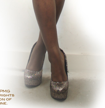
The same costume used in the music video and Digipak is effective and makes the music video successful.


MISE EN SCENE:

THERE IS A CLEAR LINK OF THE SAME HIGH HEELS BEING USED IN THE MUSIC VIDEO AND THE DIGIPAK, AS WE WANTED OUR ARTIST TO BE REPRESENTED AS A GLAMOROUS WOMEN, WE USED HIGH HEELS TO BE A DOMINANT PROP IN OUR MUSIC VIDEO, JUST LIKE OTHER TOP FEMALE ARTIST SUCH AS BEYONCE. THIS CREATES A VISUAL IMAGE OF THE ARTIST AND GENRE OF R'N'B.

here is a shot from one of Beyonce's video, it is effective how she is wearing the same clothes through out however, the heels are a different.


Digipak
Music Video

The poster is also an important part of the package, as this is one of the main product that would promote the artist.

I have decided to have the outfit (black dress) that is on the Digipak to be the same on the poster this is so that there is a clear link, and that the audience could be more familiar with this artist.

Advert
Digipack - Same black dress
Also for this promotional package, I have kept the same font and colour code through out, in the Advert and Digipak, because having different colours would look unprofessional. 

This continuity, would attract the target audience as, obvious links, lets audiences adjust and be more familiar with the artist.


The Specific target audience for our artist would be young female groups in the age of late teens and listen to R'nB music and love high street shopping and , as our artist

 
"CHRYSTELLA" ,

.....represents a glamorous out going and fashionable artist.

I have also Kept the name of the Artist in the same format,in my Digipak and Advert, so that audience could become familiar with the name tag.

Here are some Examples of other artists, name tags;


Wednesday, 18 January 2012

Evaluation 2: How effective is the combinatin of your main product (video) and ancillary texts (digipak and advertisment)?

I have a full understanding that there should be clear visual links between the Digipak and Advertisment to establish the artists image, The style we used throughout the music video and how it links to the digipak and advertisment.

make an avatar
I have used gifs by going onto http://picasion.com/ and uploading images. I used this website to show how i have deliberately used visual references with all my products through camera shots. My main shots were taken at medium close - up as i wanted to make sure that all my ancillary products including my music video related to each other. I wanted there to be a special link between all the products therefore i have continuously used medium close - up shots, to allow the audience to always feel connected in some way with the artist.
 I used the mediusm shots for my ancillary product because i wanted the audience to be bale to imagine her their with them. Chrystella's continuous eye contact with the viewers allow people to realise not only do they want to have a close relationship with her, but they also see she is also trying to connect with them.
i have chosen these shots specifically to show that they all link with each other, not only do they have same camera shots, the lipstick that is used is red in the music video, digipak, and advertisement. We had made sure that we had the same eye make up or very similar throughout the products . Her hair style was up in this clip of the music video and in all of the ancillary products which shared a similar link. the earrings that have been worn a in the music video and the product have a gold outline witch signifies similarities in that specific area.


this is our mood bored that we made in the beginning when we was trying to find out what type of style Chrystella was going for.  While building Chrystella as an artist we have come to find that she is a glamerous, very feminine with a a fierce personality. I have made another mood in addition to this mood board to present her as an artist. Both these mood boards complimet each other becasue one is about the style and broad RnB genre of Chrystella, while th eother is about Chrystella's peronal stye and appearance; Which is manifested through her music video.
below is a mood board of chrystellas style and how she looks. Also it shows how her hairstyle is similarly done to ur music videos and i have shown this on the mood board by getting artist and taking images of their hair; having images of the leather jacket that she wears in the music video, sparkly heels, skinny jeans.


Our audience
our music video and anacillary product related to the female audience. Below i have done a target audience profile to show what type of person would be listening and watching Chrystella.

Our key Costume

As most artist have key prob our key coustme was the continuous red lips in every shot and in every image on our anacillary product. the reason for this is because we fell that red connotes sexiness, passion,  fierceness, confidence because red is such a bright and bold and all these words reflect Chrystellas character.
My particular artist wears red lipstick because it is a really radiant colour that not a lot of people have the confidence to actually wear bright colours and we wanted are character to take that risk and wear it because it shows that she is not afraid of anything. we also done this because we wanted fans who look up to our artist be able to feel fearless too.


Ancilary font

I wanted to lhave links throughout my ancillary product and i have made sure that i used the same font thoughout and i have used 2 fonts, all of the texts styles that i used were in photoshop. The main two fonts that i used throughout my digipak and advertisment were called Copperplate gothic Bold and Copperplate gothic light. The reason why i have used this style of text is because i want my ancillary products to look simple but also eye catching at the same time. I wanted the font to reflect our Artist's character and her personality as she is an easy going person. The font is very personal and girly because it looks like it could be her possible handwriting, therefore allowing the audience to feel that the ancillary products were specifically made for them. 


As you can see i have also decided to keep the theme red as it link with my music video; the costuming of her red lipstick. I wanted to keep that theme throughout my overall product as it does not confuse the audience as they may start to question her personality if there were more 3 fonts and more than 3 colours.


Viewers feed back on my ancillary product.


Evaluation - Question 2 - How effective is the combination of your main product (video) and ancillary texts (digipak and advertisement)?

For this project to be successful I had to keep in mind the fact that the ancillary texts and main products had to be successful when  looked at on their own and even more when the two were combined. The main aim was to make sure that if the audience saw either the digipak , advert or video – that they would be able to recognise them in a different place. For example if the audience saw the advertisement on a billboard in the city they would see the music video on their TV and instantly realise that they belong to the same artist – creating a clear brand identity. This was done through many ways – such as consistency in the colours and certain themes.

The conventions of the genre were a way in which I made sure the products were effective. Such as having a glamourous overtone - which is seen through the black and white colour scheme and outfits the artist is wearing. The gold earrings that are seen in the advertisement and digipak connote a sense of wealth and relate to the theme. 

Locations in the products also kept the products consistent and effective.The video had several different locations in it including an outdoor location and shots taken within Chrystella's bedroom. In the video is a clear motif of artistic / colourful backgrounds, which can be seen in the GIF below. These shots contrast with the digipak but in the bedroom scene there is a clear shot with a blank / white background which relates to the digipak. 


how to make a gif


Camera angles were another way in which the two products have a visual relation to each other. On the front cover of the digipak is a close up shot of the artist. This is reflected in the video during the base track with the painting in the background. 


how to make a gif

The fonts in both the advertisement and digipak are the same as there is no font in the video it cannot relate. 
Collage of the font being used on advertisement and digipak


The costumes in both products are also easily relatable. Even though the outfits are not exactly the same , both have a glamourous undertone but could be still seen as casual. The video features several different outfits - however there is a strong theme of black running through the outfits. In relation to the digipak  - the outfit the artist is wearing is also black. 


Another main aim of the conventions of the products ( apart from promoting the brand identity ) was to attract the target audience. As explained in a previous blog the target audience for the artist is young ( 16 - 25 year old could be a student or working full time)  black british , female , and very fashion conscience. 


Overall I do think that the products would perfectly attract the target audience as Chrystella is a representation of what they aspire to be / already are. Her dress sense is very easily copied and is appealing to young females. The locations that are featured in the video would attract the audience as they are places that they could easily go to / have already been - making her more relatable to the audience. Her overall look and personality within the video are very friendly and have a fun vibe  - this again makes her more attractive to the audience.  


Tuesday, 17 January 2012

EVALUATION 1


ANCILLARY PRINTS AND PRODUCTS


This is a video i made using 'ishowu' to show you (haha) the difference between Dizzee rascals video 'holiday' to our video. There are clear visual difference in terms of clothing, perception of women and the way the camera has been placed to amplify sexiness in 'holiday' to the sexiness in our video. 


EVALUATION 1; In what ways does your media product use, develop or challenge forms and conventions of real media products?

WHAT CONVENTIONS ARE USED IN MUSIC VIDEO'S?
-Editing is Quick (edit to the beat )
Avoids the normal of continually editing.
Usually 3 minutes long. For our music video production we used FINAL CUT PRO.
Tools


MUSIC VIDEO'S ALSO BREAK THE RULE OF CONTINUALLY EDITING, BY HAVING ADDED EFFECTS (SLOW MOTION, SPECIAL EFFECTS, BASE TRACKS AND REPEATED SHOTS) CAROL VERNALLIS THEORY: 
" Edits seem to have a rhythmic basis closely connected to the song". EDIT TO THE BEAT IS REALLY IMPORTANT IN MUSIC VIDEO'S BECAUSE IT GRABS THE AUDIENCES ATTENTION, AS TO HAVING AN UNSUCCESSFUL MUSIC VIDEO, THAT CUTS IN THE MIDDLE OF A WORD (the artist singing).  
For example; Kanye west ft Rihanna - All of the lights.
This music video has various different jump cuts (one shot to another) and most importantly edits on the beat. It also has different base tracks. 
Most significantly, it has Special effects. (flash lights).


 Different camera angles is also important such as CLOSE UPS, EXTREME CLOSE UPS,  MID SHOTS AND LONG SHOTS of the artist having eye contact with the camera.
THIS SO THAT THE AUDIENCE FEEL MORE CONNECTED TO THE ARTIST AND SO THAT THE AUDIENCE DONT LOSE INTEREST, AS IF A MUSIC VIDEO WAS JUST OF ONE PERSON SITTING THE CORNER SINGING THROUGHOUT WITHOUT ANY JUMP CUTS, BASE TRACK OR DIFFERENT SHOTS, THEN THE AUDIENCES WULD CERTAINLY LOSE INTEREST.  


ANDREW GOODWINS THEORY; THREE MAIN TYPES OF MUSIC VIDEO STRUCTURES.  different shots are to with verses and the chorus.


1. Illustration - this is mostly to do with performance and demonstration of some of the lyrics.
Kanye West ft Rihanna - All of the lights is an example of an illustration.


2. Amplification - this is when videos introduce new meanings that do not contradict with the lyrics, but adds layers of meanings. 
Katy Perry - Fireworks, is an example of Amplification.


3. Disjuncture - this is where there is little connection between the lyric and video or where the video contrasts the lyric.
Chris Brown ft Benni Benassi - Beautiful people, is an example of Disjuncture, as the music video a lot of people in a crowd dancing in a concert, where as the song is about  "Beautiful people".


SPECIFIC GENRES
a specific genre is always different to another different genre in music video's
For example the genre TEENAGE POP SONGS would have a lot dancing, such as an S CLUB 7- (reach for the stars)
music video is completely different to an R'n'B (genre)
as stereotypically in an R'nB music you find girls in
the bikini dancing, and the men with there flash cars and Bling Bling Jewellery, such as R.Kelly ft Cassidy - hotel.


A MUSIC VIDEO CREATES A VISUAL IMAGE OF THE ARTIST AND A MUSIC VIDEO WOULD APPEAL MORE TO ITS AUDIENCE. MOST MUSIC VIDEO/S HAVE THE CONVENTION OF THE ARTIST MAKING EYE CONTACT WITH CAMERA, AS IF THEY ARE SINGING TO YOU.


THE GENRE OF OUR MUSIC VIDEO IS OF R'N'B/POP.

ONE OF THE FEMALE ARTIST THAT HAVE INSPIRED US IS JESSIE J.
JUST LIKE JESSIE J'S VIDEO (DOMINO) WE WANTED THE ARTIST TO BE THE MAIN FOCUS OF THE VIDEO, AS THIS ALSO IS A GOOD WAY OF PROMOTING THE ARTIST.


WE WANTED TO CREATE THAT GLAMOROUS LOOK FOR OUR ARTIST BY HAVING CLOSE-UP SHOTS OF THE FACE. SIMILARLY TO JESSIE J'S VIDEO WE DECIDED TO HAVE A BACK DROP A OF BRILLIANT ART WORK, THIS HAS A BIG EFFECT ON THE ARTIST AND MAKES HER STAND OUT MORE.


CLOSE-UP ON THE EYES IS EFFECTIVE AS IT SHOWS THE DAZZLING GLAZING  SIDE  OF THE ARTIST.                        
BEYONCE IS ANOTHER FEMALE ARTIST THAT INSPIRED US, FOR OUR MUSIC VIDEO, BY CREATING A GIRLY EFFECT,  HAVING SHOTS OF HIGH HEELS.


RIHANNA HAS ALSO INFLUENCED US FOR OUR MUSIC VIDEO AS IN ONE OF VIDEO (ONLY GIRL) SHE IS THE MAIN FOCUS OF THE VIDEO AND SHE FLICKS HER HAIR, WHICH IS SOMETHING WE USED IN OUR VIDEO; THIS MAKES THE ARTIST LOOK MORE ATTRACTIVE.


PROMOTIONAL ADVERT

INSIDE PANELS OF DIGIPAK