Showing posts with label shani henry. Show all posts
Showing posts with label shani henry. Show all posts
Wednesday, 16 May 2012

Saturday, 28 January 2012
GOODBYE BLOGGER
This has been a fantastic journey and i have learned do much. The music video overall was a great accomplishment as i felt i put 100% into my work and i felt that it was a successful outcome. My ancillary product i thought was EXCELLENT! as i had the chance to make a CD cover that i felt look really professional and as i aid before i gave my all into the whole project. This has been a great!
Thursday, 26 January 2012
Evaluation 4: What you learned from your audience feedback
Below is a video of someone from that i recorded during class and i am going to analise a specific comment that he had made which was 'At time we could she was singing it clearly and you could see every lip movement but at other times you could not see that well' I thought about this comment really hard and realised that we could have made her rehearse the words more as it would of made a huge difference to out music video. It would have also made it a lot easier for us to edit as she would have been singing on time with the actual track which would of made it easy for us when it came to cutting to the beat, and also when marking. This is because when we edited on the beat if she had known all the words it would of been easier and a lot quicker for us to lay the shots down and in place. This would of given us enough time to make even more important improvements. Nevertheless we would have changed this by making sure that she had learned ALL of the words, not just most of them. This comment has made me look at my music video in a different way as now when i look at my music video i can see where we could have made her rehearse the words more and make her say the words a lot clearer simply because when i look back at my product her music video some of the words are not as big and bold as the others.
Below is another video where i have recorded the feedback comment from a member in my class after the lesson. The comment that was made was 'Its a female empowering and feminism in a respectable way' and 'The artist who re did the video who is Caroline did really well because she sort of gave it a different concept and he put an original spin to the concept' I was really pleased with this comment because she instantly understood what type of Character the artist was and what she was trying to represent. We didn't want our artist to symbolise sex, or be treated as a sex object, and the original music video was sexy and interacted with the opposite sex where as our music video didn't. Therefore i have learned that we have reached one of our goals by getting the audience to recognise what we wanted them to see and feel towards Chrystella our artist.
Our overall feed/reaction back from our music video was positive. We knew which part the students really enjoyed as they were cheering and making noise which symbolised their excitement and shows that they were impressed. I felt that the cinema played a huge contribution to our music video as it emphasised on our editing and it was more effective as the we were surrounded by the music.
Below is a video of the audiences overall reaction when watching the music video:
Below we recorded people outside the cinema to see their reaction, and to see what people personally thought of our music video. We asked for positive an constructive criticism because as we wanted to know and think about potential changes and improvements we could of made. The first feedback that we recieved were from EMILY AND ETEHL. Their positive criticism that stood out to me the most was that "more locations could have been used"
I learned that there could have been more of a variety of locations just to make the music video look more like a professional music video. I have learned whilst looking at other performance music videos that they have several locations and we lacked a bit on location i have to admit. However for the future if I was ever given a project like this to do i would absolutely make sure that I Have at least 8 locations just so that the music video is more appealing to the audience and so they feel as though they are being taken on a journey. This makes me look a my product a little differently than before because i have realise that we did lack in location which could have made our music a lot better.
Below is a screenshot of the comments that were made on our music videon on Vimeo! there is a comment that was the same as most of the other comments, which was that we needed more 'locations' this i definitely have learned that we should have had more locations.

Tuesday, 24 January 2012
Evaluation Qu3: How Did You Use Media Technologies In The Construction And Research, Planning and Evaluation Stages?
Using Media technology for the construction and researching, planning and the evaluation stages is a must! this is because it allows me to find out more information that helps me to gain knowledge for my research around my ancillary product, and my music video, it also allows me to show my work.
Blogger is adaptable and is the main source for this coursework as, all pieces of work is uploaded onto the blog enable for us to illustrate and show what we are learning and have been taught. It is very convenient as it allows me to look back through my blog posts and see what my plan was in the beginning of when we started to film and edited. Therefore enabling us to be able to get on with the filming a lot faster and fluently because we have the plan there to help us and remind us of what we are supposed to be doing.
Blogger is very versatile as it can be accessed from ANYWHERE on a mobile phone on the internet at home, college, ps3. This is convenient as it allows me to be able to be able to keep in touch with my work from home also view teachers lessons as they tend to briefly type up on the moodle, prezzie.
In addition This allows me to view feed back from other teachers, students which is an advantage to me as i take the positive criticism and improve my post.
Blogger allows me to upload pictures, music videos, presentations, screengrabs.
Below i have used Voila to demonstrate how i use blogger.

Prezi was a good technology when presenting my work as a presentation. Although i could have used Powerpoint i felt that Prezi had more technology that was nice to look at and i could be as creative as i felt. Prezi allowed me to creat unique presentation that had different themes, colours. What really impresses me about Prezi is the fact that it had so many things i could add to it for example Path. This allows me to arrange my text, images, video in the format i want it to be in. It also helps the viewers to not get lost on the page as it can sometimes be very hard to control therefero it takes the viewers on a smooth journey. Youtube played a huge contributions to my research when looking up my artist genre and other artist that are apart of the same genre. As my artists is a raper and a singer it was good for me to use youtube as i was ablkt to see rap/singer artists from all over the world and be inspired by their music video. I love the way that YouTube have Suggested videos on the right hand of the page. This asset of the website is extremely great as it allows me to look at other artist that i may not have even heard of before and are from the same genre which makes my research a lot easier and is very helpful. below i have a video tutorial of me talking about how I use YouTube and a screen shot of YouTube.


.png)
When research our artist and our record label and the genre of our music it was essential that we had background history of all of this therefore Wikipedia was a website i used. This is because then it allowed me personally to feel connected with the artist and i felt that without the connection or knowing what type of genre your artist is doing it doesn't make a successful video. I felt that i had to educate myself on the background of the genre type and this allowed me then to put this into practice and use my knowledge to create a good music video. Below is a video on how i use this.
Final Cut pro was a major technology that i used for my music video. This is because i used this all my my film editing. This allowed us to create effects and turn our music video into slow motion. It allowed us to cut to the beat and lay the tracks down and view our work whilst editing it just like a professional. I really got the hang of using this as i felt i have become more confident and understand the tools a lot more. There are loads of tools that can be used and effects. The tools that i mainly used was the razor tool. Below are screen shots of the tools that i used when using final cut pro.


Photoshop played a big part in my work when i was doing my ancillary product. i was able to do so many things i would of not of been able to do without it. As i looked at other digipaks i saw how the artists skin was flawless and i wanted that same affect on my artist. Therefore i used the blur tools and changes that. I used heeling patch tool to correct any imperfections on her skin to make her skin look smooth and not rough. Overall Photoshop allowed me to get that 'Professional' look that i was going for. She looked healthy and glamorous which was what i was aiming for.


When making our storyboard animation music video we used the digital camera to show what we were aiming to achieve with our music video, and what we wanted our video to come out like, or at least similar as we did make slight adjustments. Below is our animation.
Wednesday, 18 January 2012
Evaluation 2: How effective is the combinatin of your main product (video) and ancillary texts (digipak and advertisment)?
I have a full understanding that there should be clear visual links between the Digipak and Advertisment to establish the artists image, The style we used throughout the music video and how it links to the digipak and advertisment.

I have used gifs by going onto http://picasion.com/ and uploading images. I used this website to show how i have deliberately used visual references with all my products through camera shots. My main shots were taken at medium close - up as i wanted to make sure that all my ancillary products including my music video related to each other. I wanted there to be a special link between all the products therefore i have continuously used medium close - up shots, to allow the audience to always feel connected in some way with the artist.
I used the mediusm shots for my ancillary product because i wanted the audience to be bale to imagine her their with them. Chrystella's continuous eye contact with the viewers allow people to realise not only do they want to have a close relationship with her, but they also see she is also trying to connect with them.
i have chosen these shots specifically to show that they all link with each other, not only do they have same camera shots, the lipstick that is used is red in the music video, digipak, and advertisement. We had made sure that we had the same eye make up or very similar throughout the products . Her hair style was up in this clip of the music video and in all of the ancillary products which shared a similar link. the earrings that have been worn a in the music video and the product have a gold outline witch signifies similarities in that specific area.
 this is our mood bored that we made in the beginning when we was trying to find out what type of style Chrystella was going for. While building Chrystella as an artist we have come to find that she is a glamerous, very feminine with a a fierce personality. I have made another mood in addition to this mood board to present her as an artist. Both these mood boards complimet each other becasue one is about the style and broad RnB genre of Chrystella, while th eother is about Chrystella's peronal stye and appearance; Which is manifested through her music video.
 below is a mood board of chrystellas style and how she looks. Also it shows how her hairstyle is similarly done to ur music videos and i have shown this on the mood board by getting artist and taking images of their hair; having images of the leather jacket that she wears in the music video, sparkly heels, skinny jeans.
Our audience
our music video and anacillary product related to the female audience. Below i have done a target audience profile to show what type of person would be listening and watching Chrystella.


 below is a mood board of chrystellas style and how she looks. Also it shows how her hairstyle is similarly done to ur music videos and i have shown this on the mood board by getting artist and taking images of their hair; having images of the leather jacket that she wears in the music video, sparkly heels, skinny jeans.
Our audience
our music video and anacillary product related to the female audience. Below i have done a target audience profile to show what type of person would be listening and watching Chrystella.

Our key Costume
As most artist have key prob our key coustme was the continuous red lips in every shot and in every image on our anacillary product. the reason for this is because we fell that red connotes sexiness, passion, fierceness, confidence because red is such a bright and bold and all these words reflect Chrystellas character.
My particular artist wears red lipstick because it is a really radiant colour that not a lot of people have the confidence to actually wear bright colours and we wanted are character to take that risk and wear it because it shows that she is not afraid of anything. we also done this because we wanted fans who look up to our artist be able to feel fearless too.

Ancilary font
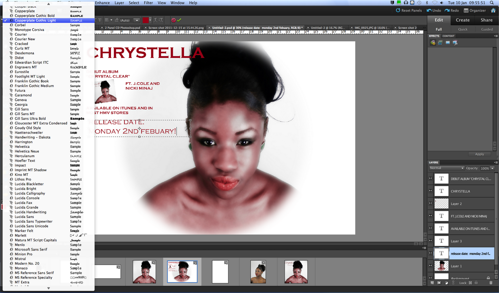
I wanted to lhave links throughout my ancillary product and i have made sure that i used the same font thoughout and i have used 2 fonts, all of the texts styles that i used were in photoshop. The main two fonts that i used throughout my digipak and advertisment were called Copperplate gothic Bold and Copperplate gothic light. The reason why i have used this style of text is because i want my ancillary products to look simple but also eye catching at the same time. I wanted the font to reflect our Artist's character and her personality as she is an easy going person. The font is very personal and girly because it looks like it could be her possible handwriting, therefore allowing the audience to feel that the ancillary products were specifically made for them.


As you can see i have also decided to keep the theme red as it link with my music video; the costuming of her red lipstick. I wanted to keep that theme throughout my overall product as it does not confuse the audience as they may start to question her personality if there were more 3 fonts and more than 3 colours.
Viewers feed back on my ancillary product.
Thursday, 12 January 2012
In what ways does your media product use, develop or challenge forms and conventions of real media products?
I used Photobucket to edit these photos and put them into a slide show, just to show how we made our video not look too sexual
Below i have used Snapbucket to show how we have also kept some conventionals the same. e.g the shots and the close ups of lips, eye. ect. We also made sure that we edited on the beat that showed how we kept the same conventions so it was easy for the audience to establish the artist.


Below i have used Snapbucket to show how we have also kept some conventionals the same. e.g the shots and the close ups of lips, eye. ect. We also made sure that we edited on the beat that showed how we kept the same conventions so it was easy for the audience to establish the artist.


Tuesday, 10 January 2012



Thursday, 5 January 2012


Tuesday, 13 December 2011
final font
I went on to www.dafont.com and i chose 6 fonts that i liked and that i thought would go well with my theme for my digipak. As i explained before i did not want to use anything that did not symbolize or mirror our artists character. Chrystella's is humble, classy, bold and charming, therefore we did not want to go for a font that was Gothic or too girly or childlike as that's nit the image that we are trying to put out to the viewers. The image that we are putting out to the viewers is that Chrystella is urban, young, classy, full of energy.
The font that i finally came to a decision to use as my main font was Balmoral. I wanted some advise so i asked my teachers on what they thought would look best with my digipak, and soon after i found a font that i absolutely feel in love with on Photoshop; Copperplate Gothic light and Copperplate Gothic bold, these are the fonts that i have decided to use, based on the fact i wanted to keep my digipak looking simple but classy and readable at the same time.

editing images on photoshop for digipak
Being able to shoot photos for our digipak in the photography room using a kodak camera we had some ideas about how we wanted to present our artists. The thing is we didn't want to portray our artist in a sexual way as that is not what our artist is about. She is all about empowerment for all females and to be able to put across to the world that being half naked isn't the only way that female artists sell, its purely based on talent and being able to connect with the audience. We wanted our artist to look sophisticaed and sexy without showing assets of her body parts.
As i looked back at my image i noticed that i could add more to enhance her look and make her look fabulous. As i am a photography student as well i am familiar with Photoshop and realized that i could do so much more with the images. As all human beings and celebrity's, artist also have flaws that are either covered up with makeup or using technology, as we didn't glam up our artist too much using make up it was easier to Photoshop. Our artist had scars and dark patches on her skin which were visible in some places but nothing that photoshop couldnt handle. Below is the artist and her normal skin without the photoshop affect(the image that is shown is not the same pose for my front digipak but i just wanted to show the scare and how the skin wasnt photoshoped before so you can tell the difference):

As you can see her skin was smooth but editing would make it look even better. In photoshop i used the Clone stamp tool; >>>

which basically copy's a part of her skin that is flawless and i can then paste it onto the piece that needs to be covered up as you can see below she had a scare and now it has disappeared. (screenshots step by step of how i achieved a scare less look):


I adjusted the diameter so that it could cover up more in a short space of time.


After achieving this look i decided i wanted to airbrush the image by using blur on Photoshop, Below i will show step by step how i achieved flawless skin. (I am now using the image that i used form my digipak):


As you can see i had to play around with the Radius and the Threshold as i didn't want her to look too fake and but just right and natural, after this i played around with the lighting as i wanted her lips to pop out.
After i had edited all that i thought was needed i went on to www.rollip.com, where i can upload the photo and change the effect and so i did. below is the final image:

I am extremly happy with how the image has turned out as i feel that although it was a long process in finding the right lighting effect and the right contrasting effect it worked perfectly fine. i feel that the lips and the green ear rings pop out to the audience and her skin looks glossy and flawless and this is the look that we are going for. I especially chose this image because i was inspired but "The Saturdays" album cover where it was all head shots of them and i thought it was really different, clean and classy. (below the saturdays album cover)

Subscribe to:
Posts (Atom)