This project has allowed me to utilise my previous skills to a much further extent. I have learned how to plan effectively using planing sheets, taking notes effectively.
I would have to say that editing the music videos was the hardest part of the project and that is where your creativity has to kick in. Despite the difficulties I am happy to say this project has been another successful one.
Showing posts with label Caroline Aboikoni. Show all posts
Showing posts with label Caroline Aboikoni. Show all posts
Saturday, 28 January 2012

EVALUATION
QUESTION 4

This is what I recorded to illustrate the audience reaction to the music video.
1st FEEDBACK-
"sometimes you could see her lips moving, other times you couldn't"
" The pause part adds extra effect, added something extra and different to the video"
"Add more locations"
"I like the shoes part and the way you cut to the beat"
"artist presents confidence, by the way she moves"
From this feedback i have learnt that our music video, lacked in location in a way. Because we had many shots of the artist 'not rapping/singing' we could not use a lot of them. We needed three or four solid base tracks this way it cud have been easier to edit. Another comment which made me look at my music video a different way is the restricted lip movement. Reading back the feedback I have come to find that it is very important for the audience to understand what the artist is saying or doing.
If i had another chance to change the music video I would make sure to add more locations and lip sync clearly and perform every single word. That way the audience can be drawn into the artist and in return the artist will fulfil the audience's preferences
FEEDBACK- "we were able to see a variety of the artist"
Rosetta's comment highlighted the theme that we kept
throughout which was 'sexuality in a different way'
"you guys fulfilled the audience"
"More locations/transitions of shots needed", however she liked our use of mis-en-scene
rosetta's feedback on my digipak and advert
"I love it, it looks really good and professional. The way the artist is making eye contact with the audience. The layout of the promotional advert is creative and gives the artist enough space to shine. I love the red lipstick it stood out in the video and it stands out on these as well, the fierceness in her eyes will definitely draw me in to buy her album"
From this feedback and the reaction of the audience watching it, I have come to find that we reached our aim. and that was to grab the audience's attention throughout the whole music video. Feedback from others commented on the use of costume to represent the artist and the continuous representation of the artist due to her clothing and her confidence.
What I have learned is that when editing a music video, you should always try and keep that momentum you started with, some said it dropped others said they were drawn to it.
If i was to do this whole project again I would make sure to add more locations so that we have a variety because sometimes a repetition of the same thing will reduce the audiences attention.

Thursday, 26 January 2012
EVALUATION
Question 3


BELOW ARE PRINT SCREENS/SCREENSHOTS.
THIS IS HOW I ACTUALLY EMBEDDED THIS PREZZI I HAVE MADE ON THE 3RD EVALUATION QUESTION.


MY LATEST USE OF TECHNOLOGY
'iShowU
The media teachers showed classes a new way of recording information whilst
your either talking/speaking over the clip, or even point or pausing to important scenes of that clip.

Below is an example of one of the screen recordings I made with 'ishowU' to illustrate the difference in a conventional RnB music video(based on image, how they represent the image and the view of women), and our music video. I wanted to show the difference in sex appeal and confidence and I thought that Dizzee Rascals video is a perfect example of how the media can sometimes portray women as objects and 'candy' to a man's eye. Something we wanted to avoid.
The two videos will be playing side to side. You should be able to point certain shots that portray sexiness and confidence but do it in a different way to shots in Dizzee rascals video.
Tuesday, 24 January 2012
QUESTION 2
This is a video clip of me simply explaining the visual links between my ancillary products and the music video we made. I mention the reasons for these links and the effect and the impact it will have on the audience.
How effective is the combination of your main product (video) and ancillary texts (digipak and advertisement)Below are three slideshows I made to present the links between my ancillary products and my advertisement.


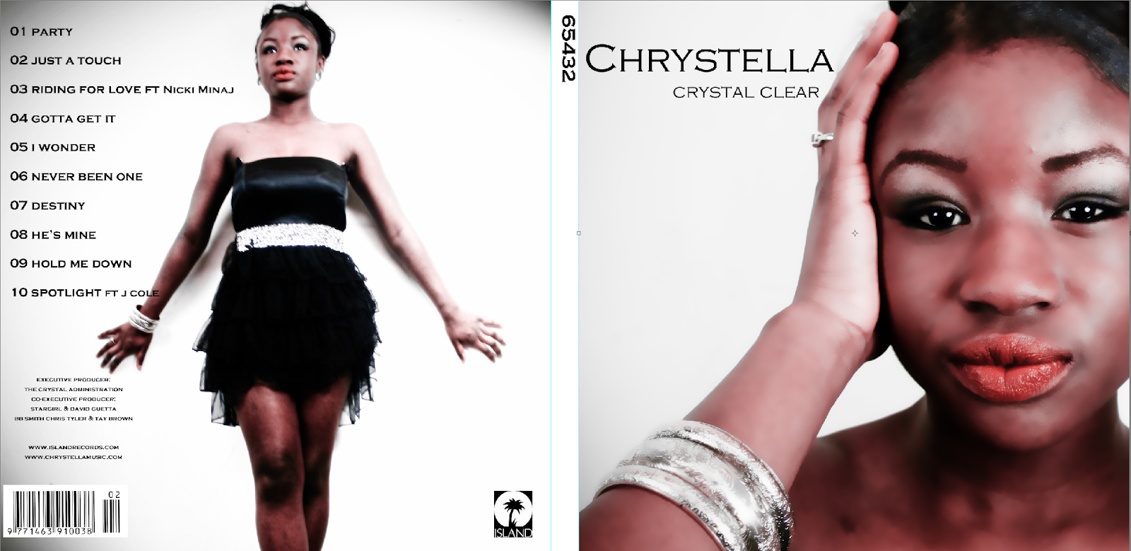
From these images you can see the clear links between my digipak, advertisement and my music video. We have made a clear link because we have kept a theme throughout. For example, same hairstyle, jewellry close ups and direct eye contact with the audience, make up and most importantly the red lipstick. The audience can recognise them as linked products simply because of the colour scheme between my digipak and advert. I decided to use a grey, white and red colour scheme because red connotes passion, fierceness, confidence while the grey and white helps the artist stand out and is linked to the artist name, Chrystella and digipak title which is 'Crystal Clear'. I wanted the colour red to be the first thing the target audience first notices and we have run this throughout our whole music video.
SCREENSHOT EXAMPLES


KEY COSTUMES
There is not one shot in the music video which does not have the artist wearing red lipstick. And this in turn could be the artists trade mark; something that her target audience/fans will expect to see every single time. for example, Nicki Minaj's 'Pink Lipstick' was noticed in many of her music videos and advertisements and is what brought her fans closer to her, and built a specific target audience and fan base.

Speaking of Audience this is an audience profile i made to represent the specific audience i wanted the music video to target.


This is a piece of work by an ex media student. This digipak and promotional advert has been my influence since designing my digipak because I wanted to create a similar layout that stands out and represents the artist as a whole, and this one does just that.
The colour scheme has been kept throughout. The purple and silver theme attracted me to it straight away and the purple connotes royalty, sensuality, and I get a regal vibe from this artist.
Her eye contact is very direct and strong. She is looking straight at the camera, even though eye contact is not kept through the digipak, the way the camera has been positioned to take the shots is very precise and still makes it appealing to the audience. An example of this is Rihanna;'s album cover 'loud'.

 |
| Calvin Harris Album Cover- 'ready for the weekend' |
 |
| A screenshot from Calvin harris music video 'ready for the weekend'. As you can see there is a clear link between his music video and his actual album. |
Tuesday, 17 January 2012
EVALUATION 1
ANCILLARY PRINTS AND PRODUCTS
This is a video i made using 'ishowu' to show you (haha) the difference between Dizzee rascals video 'holiday' to our video. There are clear visual difference in terms of clothing, perception of women and the way the camera has been placed to amplify sexiness in 'holiday' to the sexiness in our video.
We challenged the forms and conventions of an RnB music video by making Chrystella stand out through her ability of performance and not cropping face to just show her legs, or bum, or breasts. In other words we wanted to give Chrystella an identity and not make her 'candy' to the eyes of the male viewer. We didnt want to ambuptate any of her body parts, as Laura Mulvey explains in her theory. (which i have explained in detail in my prezzie presentation above)


Thursday, 12 January 2012
In What Ways Does Your Media Product Use, Develo[ or Challenge Forms And Conventions of Real Media Products
Videos I Was Influenced By!!
Thursday, 5 January 2012



Thursday, 8 December 2011
IDEAS IDEAS!. PLANNING OUR DIGIPAK


BELOW IS AN EXAMPLE OF WHAT I WOULD LIKE THE INSIDE OF THE DIGIPAK WOUDL LOOK LIKE. THESE ARE THE SORT OF THINGS WE ARE GOING FOR.

Wednesday, 7 December 2011


AUDIENCE FEEDBACK AND REACTION!!
THESE ARE THE AUDIENCE FEEDBACK I RECORED YESTERDAY!!
THESE ARE THE QUESTIONS I ASKED
ENJOYYY!!
THESE ARE THE QUESTIONS I ASKED
 |
| PICTURED: SHANI, HOLDING UP MY QUESTION SHEET. |
ENJOYYY!!
THIS IS ME RECORDING WHILE OUR C=VIDEO WAS PLAYING ON THE BIG SCREEN. LOOKING BACK AT THIS RECORDING I FEEL GREAT ABOUT THE VIDEO WE PRODUCED IN THE END AND OUT AUDIENCE SMEED TO ENJOY IT VERY MUCH. FROM THE AUDIENCE REACTION I CAN TELL THAT THEY FOUND IT ENTERTAINING AND THE EDITS AND SPECIAL EFFECTS WE USED BROUGH A POSITIVE REACTION. (BY THE WAY, MY LIP SYNCING WAS VERY ON POINT, ITS JUST THAT MY BLACKBERRY DEVICE IS VERY SLOW WHEN FEEDING BACK FOOTAGE. I THINK I NEED A NEW PHONE) ENJOYYY!!
AFTER WATCHING THE VIDEO, I RECORED SOME AUDIENCE FEEDBACK. THESE ARE TEH RESPONSES I RECIEVED (BELOW)
FEEDBACK FROM EMILY AND ETEHL- BOTH A2 MEDIA STUDENTS (BELOW AND ABOVE)
FEEDBACK FROM PRINCE- A2 MEDIA STUDENT
FEEDBACK FROM ROSETTA- A2 MEDIA STUDENT
GREEN SCREEN EXPERIENCE
YESTERDAY A2 MEDIA STUDENTS WENT TO THE GREEN SCREEN TO WATCH OUR FINAL MUSIC VIDEOS!
IT WAS SUCH AN EXCITING DAY FOR US, AS MANY OF US WERE WATCHING OTHERS VIDEOS FOR THE FIRST TIME
THE IDEA OF HAVING STUDENTS WATCH THE MUSIC VIDEOS IN THE CINEMA JUST CREATES THAT CINEMATIC FEEL AND BUILDS THAT SUSPENSE. ALSO IT IS A GREAT OPPORTUNITY FOR US STUDENTS TO GET SOME FEEDBACK ABOUT OUR VIDEO AND THINGS WE COULD IMPROVE FOR NEXT TIME!!
HERE WE GO!
HERE WE GO!
VIDEO OF THE A2 MEDIA STUDENTS BEFORE GOING IN TO SEE OUR MUSIC VIDEOS
THE ATMOSPHERE WITHIN THE CINEMA WAS VERY INTENSE BUT AT THE SAME TIME EXCITING AS EVERYONE COULDN'T WAIT TO SEE EACH OTHERS VIDEO AND OF COURSE THEIR OWN.
Final Mock Digipak!!
 This is the mock digipak i made in class. To make this digipak I made saure to put in all the conventions of a digipak. I decided to use bold , clear font to make the artist name stand out however i didn't want it to overpower the artist face.
 I made sure to also make the font simple and clear to read.
The colours i used were black and white with natural colours such as brown, cream and orange. Kind of like earth tones to represent the artist as a down to earth person.
The artist i am trying to portray in my digipak is a non-flashy artist who has a humble personality. The digipak also represents the genre of music which i created it for which is jazz and soul. Very cool calm and collected, with a hint of mystery, and this is where the use of black comes in.
Thursday, 1 December 2011


Subscribe to:
Posts (Atom)